Original Link: https://www.anandtech.com/show/7343/the-ios-7-review
The iOS 7 Review
by Brian Klug & Saumitra Bhagwat on September 19, 2013 1:25 AM EST
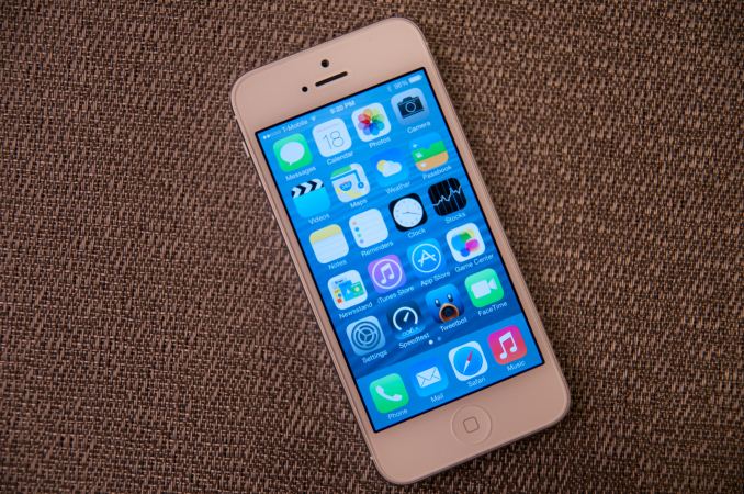
There’s no doubt about it, this iOS update is one of the largest in Apple’s history. In the wake of the iPhone 5 launch, there was a considerable amount of criticism that iOS’ visual design was beginning to get stale. The core of the interface hadn’t really changed in either visual appearance or function. With iOS 7, those pundits get their wishes granted, as almost every part of the OS gets some kind of change.
The new UI is a dramatic reimagining of the core of Apple’s mobile operating system for iPhones, iPod Touches, and iPads. The most obvious superficial change is a completely new visual appearance with a new emphasis on minimalism and simplicity. At the same time, iOS 7 is always in motion, with transitions and other effects almost everywhere you look in the OS. It’s a change that’s bound to be jarring and solicit mixed reactions initially like all redesigns are, but our thoughts have solidified since running the earliest betas up until the latest GM.
New UI
Apple’s designers were no doubt faced with a huge challenge with iOS 7. The platform has to remain familiar enough to be immediately usable and recognizable to iOS 6 and prior users, while at the same time accomplishing the goals of both modernization and cleaning up the cruft that has accumulated in some places over the past 6 major versions.
iOS 7 (Left), iOS 6 (Right) on iPhone 5
The other reality is that smartphone users no longer need a UI that emulates real-world analogues to real objects for them to be able to discover and learn the interface. Things like controls (switches, sliders, and buttons) that emulated actual buttons no longer have to appear that way to be immediately obvious. Textures and other surfaces no longer need to mimic the real world either. Instead these can now give way to something that’s minimalist and new. The educational phase is over, and for the most part smartphones are now largely mainstream rather than an enthusiast novelty or niche market. iOS 7 is the result of all that change.
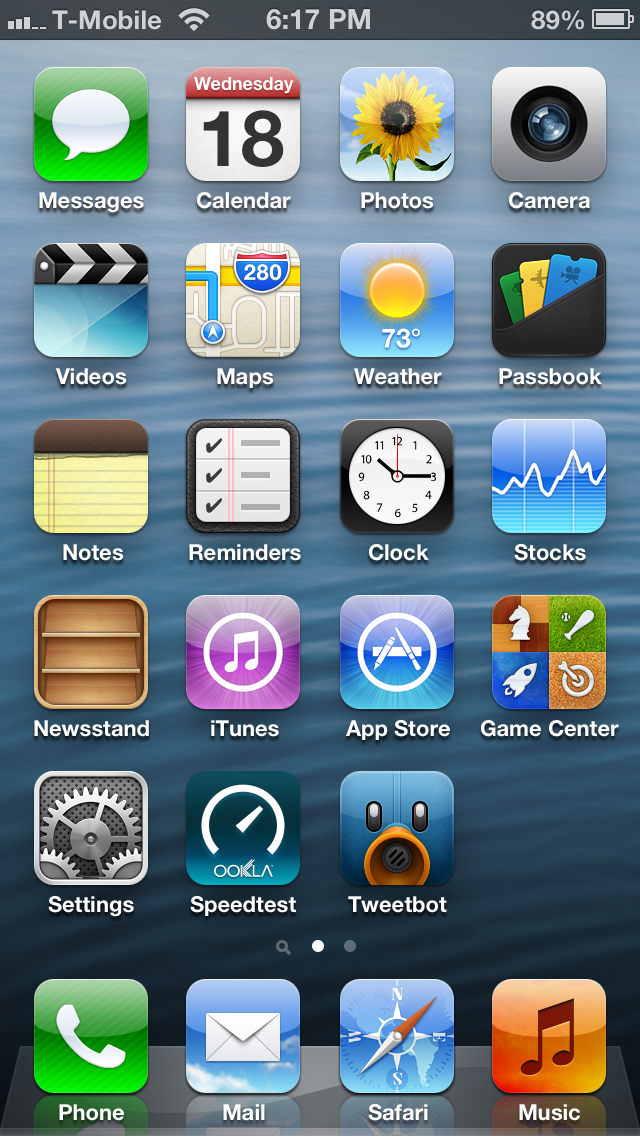
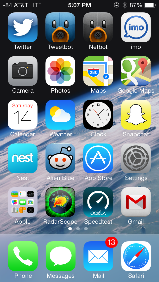
There are some obvious changes that stick out immediately, like app icons that are now a slightly larger size, a status bar area that’s now smaller and more customizable for developers, mandatory retina quality assets, new folder appearance, borderless buttons everywhere, different fonts (Helvetica Neue) and dynamic size, and a host of other first party changes.
Color Scheme
There’s really no way to avoid it, but iOS 7 moves to a completely different color palette than other releases. If there’s one thing that sticks out at me, it’s that the iPhone 5c really is the canonical correct device for iOS 7, as those devices essentially define the emphasis on color that’s visible throughout the whole OS. Each application gets a tint color that carries through it – ideally this color is used in the application icon in a very obvious way, then throughout the application to indicate interactivity.
Yellow in the notes app icon, yellow interactive elements inside
Calculator has orange function buttons on the icon, inside these buttons are still orange. Notes has a yellow strip like a notepad, inside the icon tint is yellow. Calendar has the date written in red, inside almost all the elements are red. Camera has a tiny yellow dot for the camera flash or LED AF assist, inside all the text and interactive elements are yellow. Without the shiny rounded buttons or sunken indicators everywhere, this tint color is really the only good way to know whether a certain element is actionable, and it’s a big theme in iOS 7.
Transparency
Heading into iOS 7 there was a lot of discussion about how computer interfaces were largely going “flat.” To many, that meant completely devoid of any sense of depth or z-height, to others that meant elimination of the kind of rounded, 3D buttons that previously cued users on what elements were actionable or not. While I’ll leave the discussion about what “flat” really means to human computer interface scientists, the reality is that iOS 7 isn’t really flat, and one of the most obvious places you can see that is with its use of translucency and parallax.
Transparency is everywhere in iOS 7
Translucency is a big deal in iOS 7 for two reasons. First, it’s part of the “constant motion” theme of the design, for example while scrolling a page in safari or a dialog in messages you’ll see content move behind frosted glass elements. Second it gives hierarchy cues without being obvious about it or wasting space on drop shadows. There’s a certain depth that comes with the transparent effect that makes things understandable, especially for things like the notification center and control center shades. This allows certain views to be separate in an obvious kind of way. Alerts used to be one of the last bastions of Apple’s prior love of big rounded faux–3D elements, and now are translucent. Apps also now are supposed to draw the entire view all the time, even when the keyboard is up, as it now is transparent as well.
I was a huge fan of transparency in Windows with aero glass, iOS 7 pulls off translucency and this frosted glass appearance very well, with just the right amount of opacity. There’s certainly a part of it that’s eye candy, but it does make a lot of sense in this “flat” world.
iPhone 4, iPhone 4S, respectively
The transparencies are great, but definitely computationally intensive on the GPU and obviously adds to an overdraw tax. As a result not every device that iOS 7 supports gets transparency and a blur effect, some devices just get transparency. On the iPhone side, the iPhone 4 lacks the cool blur effect in a number of places (notification center and control center are the most obvious), and iPad 3 does as well.
Fonts
iOS 7 moves to Helvetica Neue for the system font, with frequent use of the ultra light and light weights of that particular font. Apple is so proud of its change in fonts, it changed the “iPhone” font on the back of the iPhone 5s and 5c to match. It’s a not so subtle change, and iOS 7 also now places more emphasis on being typographically-centered. Much the same way that color is a theme that runs through iOS 7 applications, typography with a color tint applied is now supposed to define most of the user interface elements on their own.
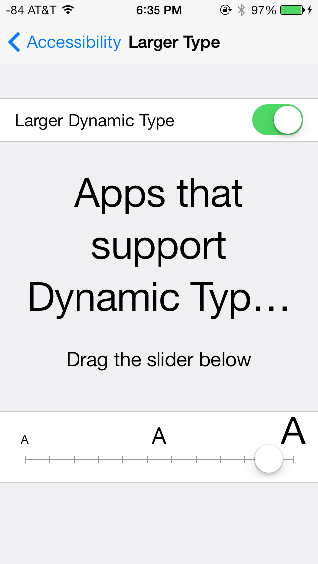
A new feature is dynamic type (through the new Text Kit set of UIKit classes), which essentially is an accessibility feature that enables users to change the font size bias system wide and in applications that use the UIFont method to get a font size. This automatically adjusts weight, character spacing (kerning) and line height, and seems like an awesome change for users who need larger font sizes for elements to be readable.

From early beta to release, font weights did change around
One of my initial big concerns was the legibility of a number of iOS 7 UI elements based on what was shown at WWDC, such as the lock screen. Initially I saw stuff like light weight fonts on a light lock screen background and low contrast between font color and what was around it, stuff that any designer would never stop screaming about. To Apple’s credit, a lot (but not all) of these pain points have been addressed now that iOS 7 is ready for wide release, but a few could still pose readability issues outside of 20-somethings with good eyesight. Apple fixed a number of these elements by just moving to bigger weights, but I suspect there will inevitably be some additional adjustment and tweaking.
The good news is that dynamic type makes it really easy to just change everything system wide or enable the bolder weight fonts through accessibility options, which moves font weights up one notch.
Transitions
iOS 7 brings motion to a whole new level, with a bunch of motion effects and gamification through both Sprite Kit and UiKit Dynamics. The short story is that these new frameworks allow developers to build applications with interactions that mimic real world physics, for example reacting to gravity or mass and user-input that triggers acceleration.
The new UI in iOS 7 uses this framework throughout for things like spring loaded animations when opening apps or going into multitasking, dismissing tabs in safari, and so on.
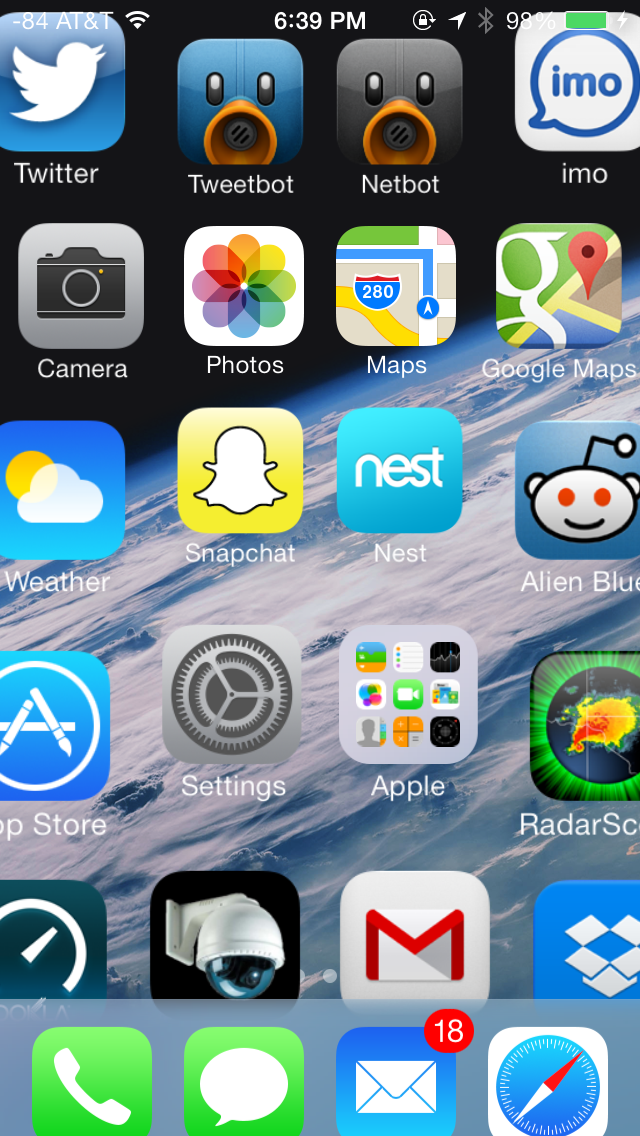
App tiles fly in, dismissed apps fly off the top
iOS 7 is very animation heavy, almost everywhere you go there’s either a subtle bounce-back (like on the passcode entry screen) or some transition. Applications float in when you go back to the home screen, notification center bounces accordingly depending on how fast you flick it down from the top of the screen, and applications zoom into or out of their icons when launched or closed respectively. It’s all a lot to look at, and iOS has always been home to design that wasn’t afraid to demonstrate how much stuff it could throw at OpenGL ES in the pursuit of making things look pretty without having FPS drops.
The only issue is that after a while some animations start being a lot to sit through each time, especially the multitasking interface animations and app fly-in. Some of these issues have been offset by making the touch targets active while the notifications are playing, but I find that it’s still not enough – going back to the home screen the app targets work, as does multitasking, but you still have to physically sit through the animation, then the action happens. It’s disconcerting flicking apps up to dismiss them and having the UI stutter and play the slide animation after the action happens.
One of my big use case is switching between messaging and the web quickly, and it just feels tedious waiting for things to happen while an animation plays. At some level animations clearly are masking loading times, and just like in OS X these will be removed slowly to make the platform feel faster, I just wish there was an option in the UI to speed things up.
App Interfaces
iOS 7 presents a fresh take on the system-wide UI, and has completely done away with the textured, gray app interface in use since iOS 1. UI elements in iOS 7 predominantly feature bold, basic colors mostly on a plain white background. Other background elements, such as those used for Spotlight, Control Center and Notification Center are varying shades of frosted gray, designed to adapt to the underlying wallpaper and user content. Iconography has also been simplified; a bit too excessively in some cases, but is applied uniformly across the OS. The in-app icons align with color scheme applied to the app (i.e yellow for Notes, red for Calendar and Music and blue for apps such as App Store, Phone and Messaging). A uniform set of icons provides for an extremely cohesive UI throughout the OS.
The UI for selecting the date, setting alarms and selecting items from drop down menus in Safari is quite bland and could have looked better with borders or other supporting UI elements. In some cases, especially on the iPad, this leads to excessive white space.
Apple has also introduced a new swipe gesture to efficiently navigate apps with hierarchical interfaces. Swiping right from the left edge of the screen takes users back to the previous screen, essentially acting as a back button. The gesture is especially useful in Safari and Messaging, allowing much faster navigation. Given the small display size of the even the flagship iPhones however, edge gestures are easy to activate inadvertently.
Swipe to delete has also been reversed in iOS 7. Rather than a left to right swipe to bring up a delete button, it’s now a right to left swipe.
The new system font, coupled with predominantly white colored backgrounds, use of transparent layers and a bouquet of bold colors applied throughout, have given iOS fresh and vibrant look, one which it desperately needed for some time now. The use of transparencies gives a sense of place within the OS, but also offers nearly infinite ways to keep the OS looking new, just by changing the wallpaper.
Lock Screen
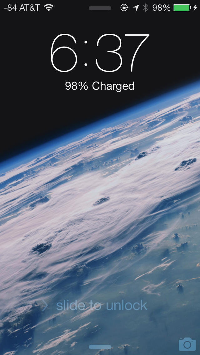
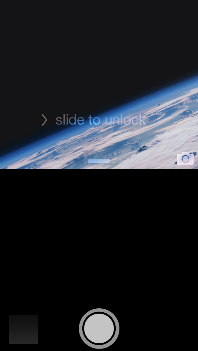
At a high level, the lock screen on iOS 7 is immediately familiar looking. There’s still the time and date displayed in large characters up top, and slide to unlock at the bottom. The shortcuts that worked before in iOS 6 also still work here, you can launch the camera by pressing and holding on the camera icon at bottom right and dragging up, for example.
What’s new is the addition of two new small rules which launch control center and notification center from the top and bottom. These quick access shades overlay themselves on the lock screen.
Notifications that have come in while the device was locked still fill in underneath the time and date, and are actionable by sliding to the right just like they were before. Only the top notification is displayed at 100 percent opacity, the others are slightly greyed out but still visible, so you focus immediately on what’s newest. When a notification has popped in there’s also a transparency which appears behind it, making it easier to read the latest notification on top of your lock screen wallpaper.
The top status bar is also enlarged relative to its appearance throughout the rest of iOS 7. Icons and font size are increased here ostensibly so they’re more glanceable. There’s no longer a huge battery icon visible when the iDevice is plugged in and charging either, so this larger status bar obviously takes the place of it.
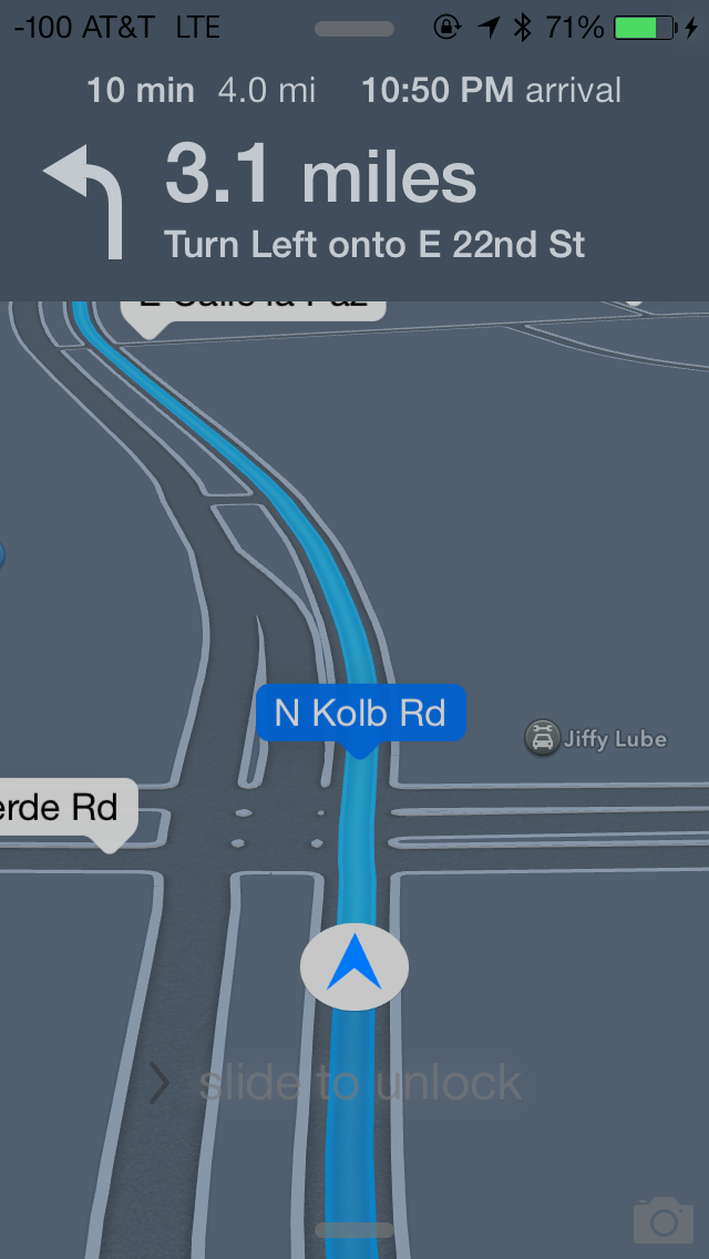
Turn by turn directions are still presented behind the lock screen while in use, now there’s less clutter in the way. Slide to unlock and the other shade and camera toggles remain, but are subtle in comparison.
The lock screen really is a microcosm of the changes that are made to iOS 7. Functionally not a lot is changed, so the existing workflows still work, there’s just tweaks to the visual appearance.
Control Center
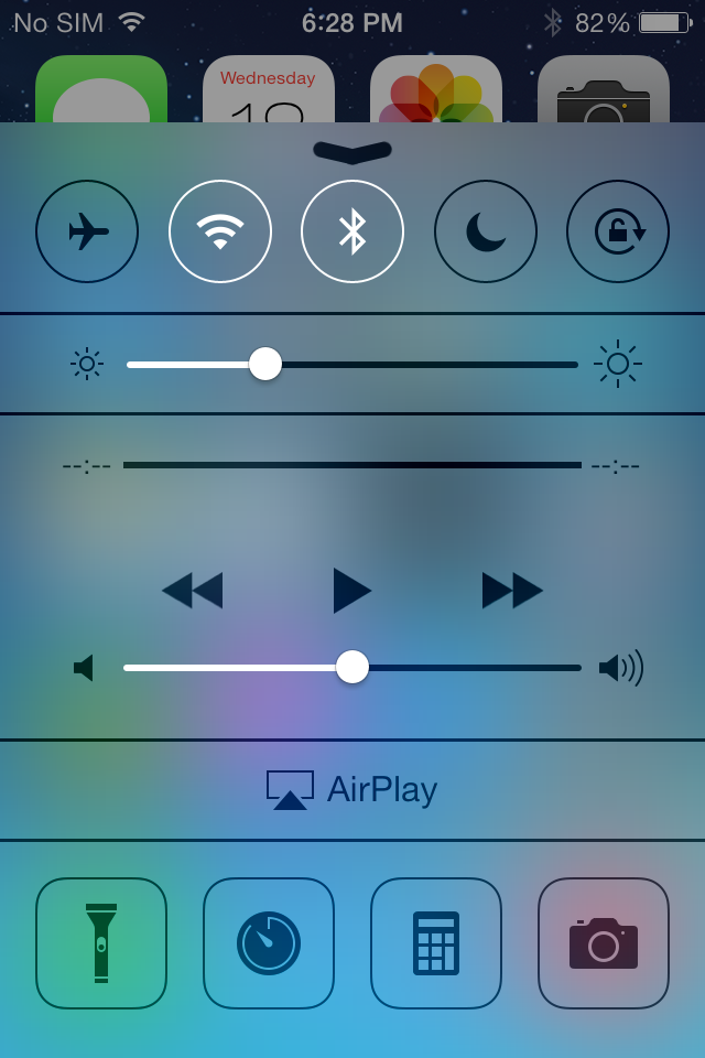
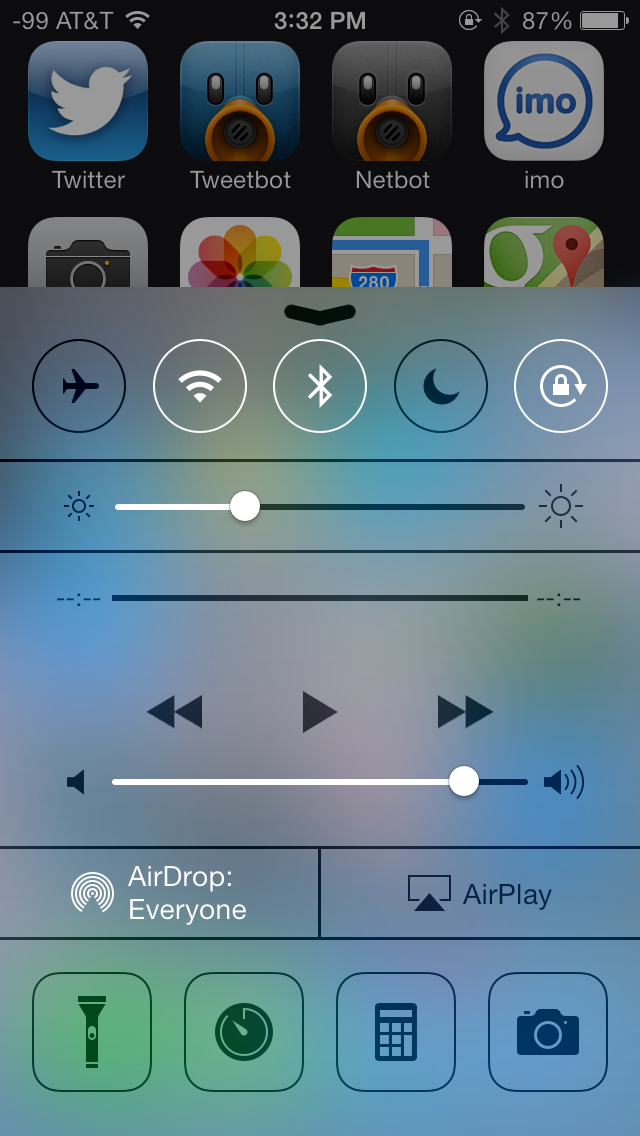
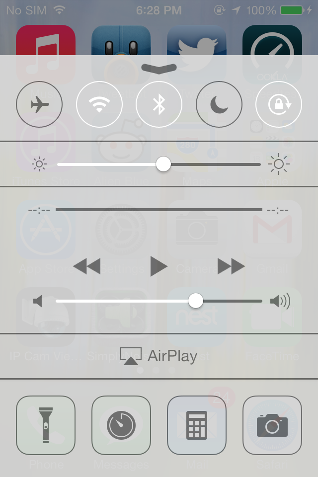
One of the big new features in iOS 7 is the addition of a quick settings menu called control center. Where notification center comes down from the top like a shade, control center comes up from the bottom and has quick access to settings toggles and shortcuts. This takes the place of the quick settings which used to exist to the left of the multitasking interface that had playback controls, rotation lock, and volume access. This also gets a transparent effect that superimposes the control center UI over whatever other view you have open.
The new control center is probably one of the most functional new additions to iOS 7. iOS has slowly filled in all the major gaps in functionality, and a quick settings toggle has been one of them for a while now. I remember running SBSettings a long time ago from Cydia and wondering why something like this wasn’t a part of iOS, control center finally fills that niche.
There’s a top bar with toggles for airplane mode, WiFi, bluetooth, do not disturb, and rotation lock. Below that is a brightness slider (although there’s not auto brightness toggle), and then playback controls. Below that is AirDrop and AirPlay, and finally underneath that are four shortcuts for flashlight, clock.app, calculator.app, and camera.app.
It’s great to have settings toggles, but unfortunately the toggles don’t double as settings shortcuts. For example you can enable or disable WiFi, but if you want to attach to a wireless network, you still have to launch settings.app and then get to it that way, instead of long pressing on the toggle in control center. The same applies for bluetooth or do not disturb, which should be toggles but also offer shortcut functionality into the appropriate page in settings.app. I’d also love it if there was a settings.app shortcut inside control center as well, or the ability to customize the four shortcuts at the bottom. It’s also a bit weird to always have the playback controls visible even when there isn’t music playing, since they take up a considerable amount of vertical space in the shade.
Notification Center
Just like control center, notifications center gets changes with new organization and visual styling. Previously notification center was just a long vertical structure – new things just piled in and stacked on top of each other. The new iOS 7 version includes three tabs with different organization - Today, All, and Missed. This entire view also has the transparency effect that makes it look like the shade is on top of whatever view you dragged it down from. What's still missing however is a 'clear all' button for notifications.
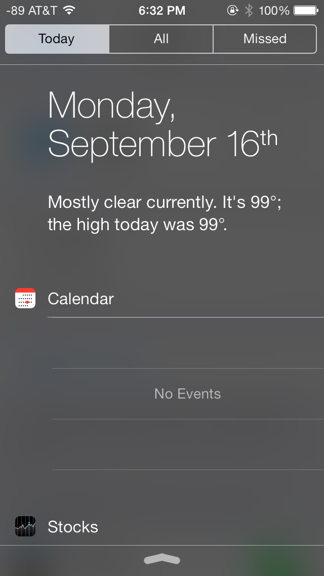
Today is designed to be an at a glance information screen that takes the place of the always-visible information from the previous version. Weather, date, calendar, and stocks are here now with completely different appearance. The topmost view includes the date and current weather, much like what you’d get if you asked Siri for the current weather. Below that is calendar with upcoming appointments, which curiously always occupies the same amount of vertical space regardless of whether you actually have any upcoming appointments.
What’s gone are the Twitter and Facebook status updates, which I never admittedly used that much from iOS 6. I guess there’s not really a good place for them under this new organization anyways.
Notifications sit under All and Missed, which self explanatory. All includes every notification that’s come in, including those while the device was in standby. Missed explicitly includes those that were never delivered atop the UI with the screen on.
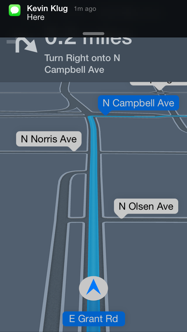
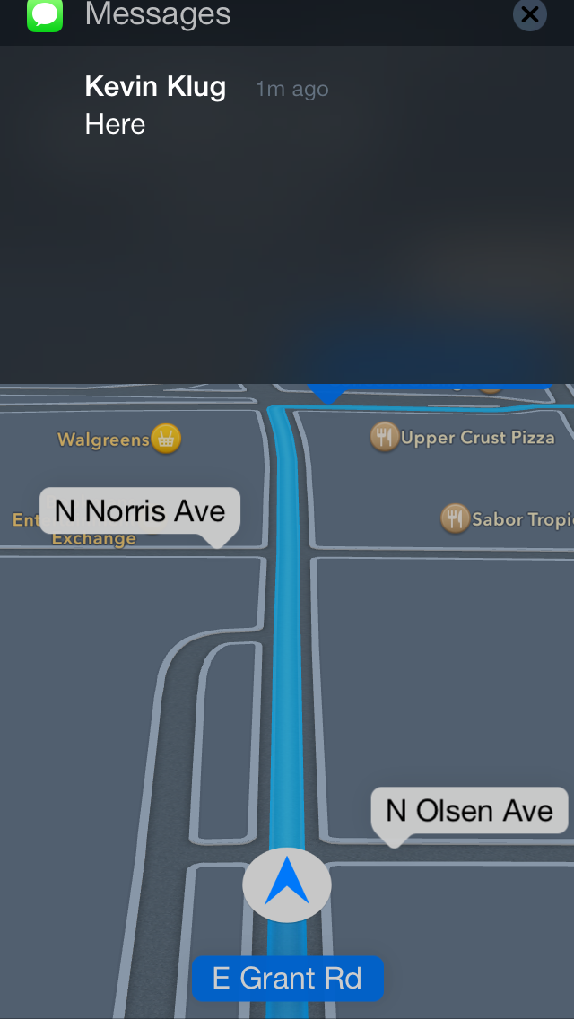
Notifications in general in iOS 7 are improved, and can now be more easily dismissed by dragging the shade up. Previously you’d have to sit through the notification animation and wait for it to dismiss itself or tap on it to act on it, you just lost the screen real estate at the top until either finished. Correction: You could flick banner notifications away previously, it's just a lot easier now. Now if you’re inside an app that uses that topmost portion of the display and don’t want to act on one, you can just drag up. Likewise if you want to act on it, dragging down works like you’re pulling on the notification shade itself.
I like those two changes quite a lot. Losing the top part of the view in an app when a notification gets delivered and then waiting for it to dismiss used to be very frustrating in iOS 6, I find being able to toss them away very handy.
Status Bar
The status bar in iOS 6 changed from being this unmutable solid color object at the top of almost every view to something that applications could finally manipulate the color of and occasionally deliver status messages with. In iOS 7 the status bar changes once again, this time it’s narrower and includes the Helvetica Neue light weight font for the time and indicators. There are actually two different font weights in the status bar, one for the time, the other for battery percentage and the operator string.
All the iconography changes here, but not dramatically, thankfully the battery indicator still tracks on a per pixel basis with battery state of charge, and the rest of the status indicators (WiFi, Bluetooth, rotation lock, location services) seem to be styled differently but aren’t dramatically different from their predecessors.
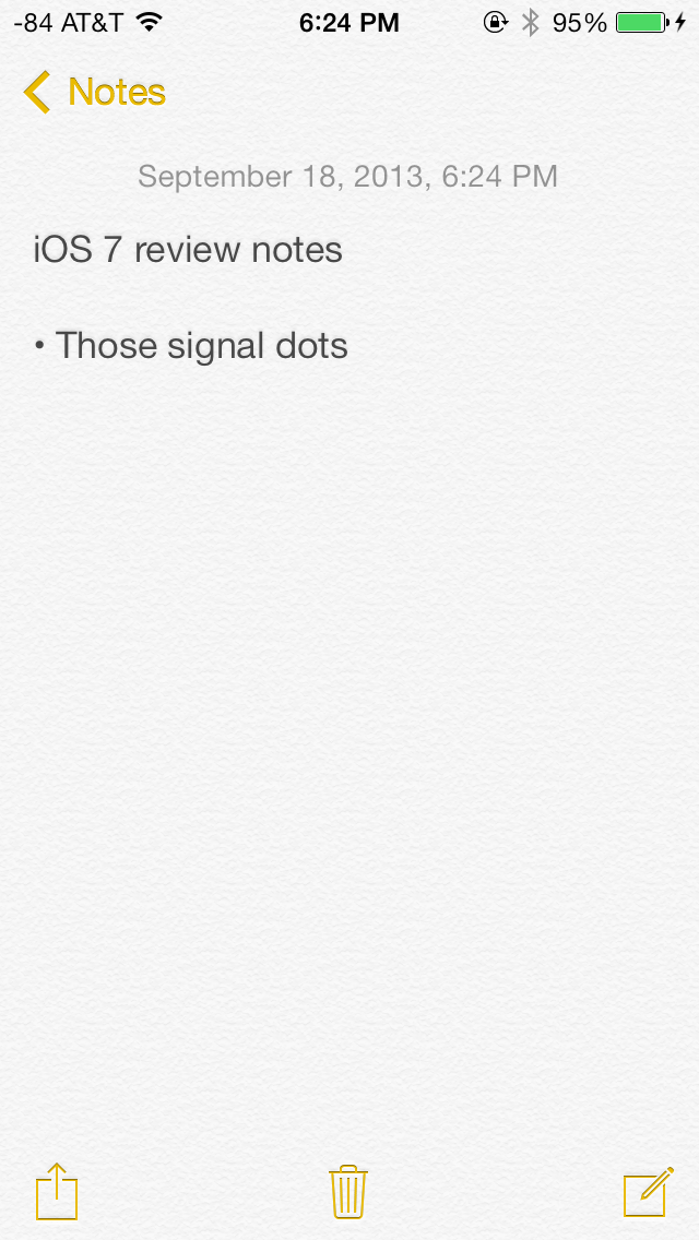
The most dramatic change however is to the signal bars, or should I say signal dots. We have a pretty interesting history going back to the signal bars in iOS with the iPhone 4 antenna situation and changes to both the visualization and bars to dBm mapping, so for me following the progression of this visualization is a big deal.
The earliest iPhone prototypes famously included dots that look identical to what we get now in iOS 7, clearly Apple’s SVP designer feels strongly about the use of circles to convey signal strength. In fact the use of circles appears a lot throughout iOS 7 – from the dialer, to the passcode entry screen, to the new design grid guidelines inside the application icon.
There are still five of them, and fundamentally as far as I can tell the mappings between dBm and dots is unchanged, so really it’s a purely aesthetic change rather than functional one. While it matches the theme of a complete redesign and the other circular design elements, the lack of any real functional change confuses me.
I guess I’m disappointed that Apple didn’t take the opportunity to do something else with the visualization entirely. I was hoping they would create either some different means of conveying cellular signal strength than just changing the tired old bars metaphor to circles which also no longer even convey magnitude. The bars at least previously each had different amplitudes, is 4 dots 4 times as good as 1 dot? Is each dot the same amount of relative change? I just find the entire metaphor tiring across the entire industry and was hoping Apple would do something other than change the bars to dots and take up more horizontal space in the the already crowded status bar.
At one point, I was hoping that the design direction for the dots would mirror the battery status indicators on a MacBook and breathe in and out to show amplitude between the cutoff points rather than this boolean on/off indicator. It just seems hilarious to me all of this traces its roots to a segmented monochrome display and has yet to be re-imagined for a modern display. Whatever the case, I continue to just switch to numerics in iOS 7 by force quitting field test (which thankfully still remains in iOS 7) since the bar cutoffs are still arbitrary and still don’t tell me what I want to know.
Home Screen
I have always maintained that iOS has evolved in a very logical and cohesive fashion over the years. Existing apps and features have built meaningfully on their predecessors in an intuitive way. The home screen however has been largely unchanged over the years, barring minimal changes to the status bar, icons and docks. The biggest change was the support for background wallpapers in iOS 4 and the Notification Center in iOS 5.
In iOS 7, the home screen has received a major facelift. The home screen now also supports a parallax effect, as icons appear to float over the wallpapers and react in relation to physical device movements. The status bar has been updated with a new battery indicator and a subtle new charging animation.
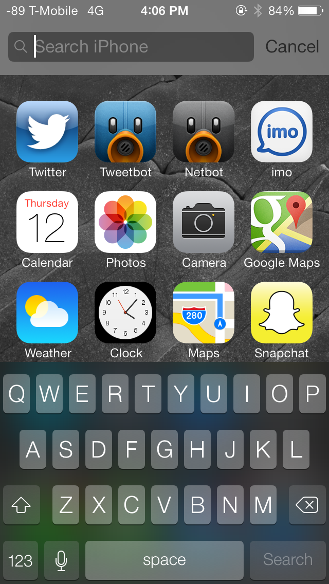
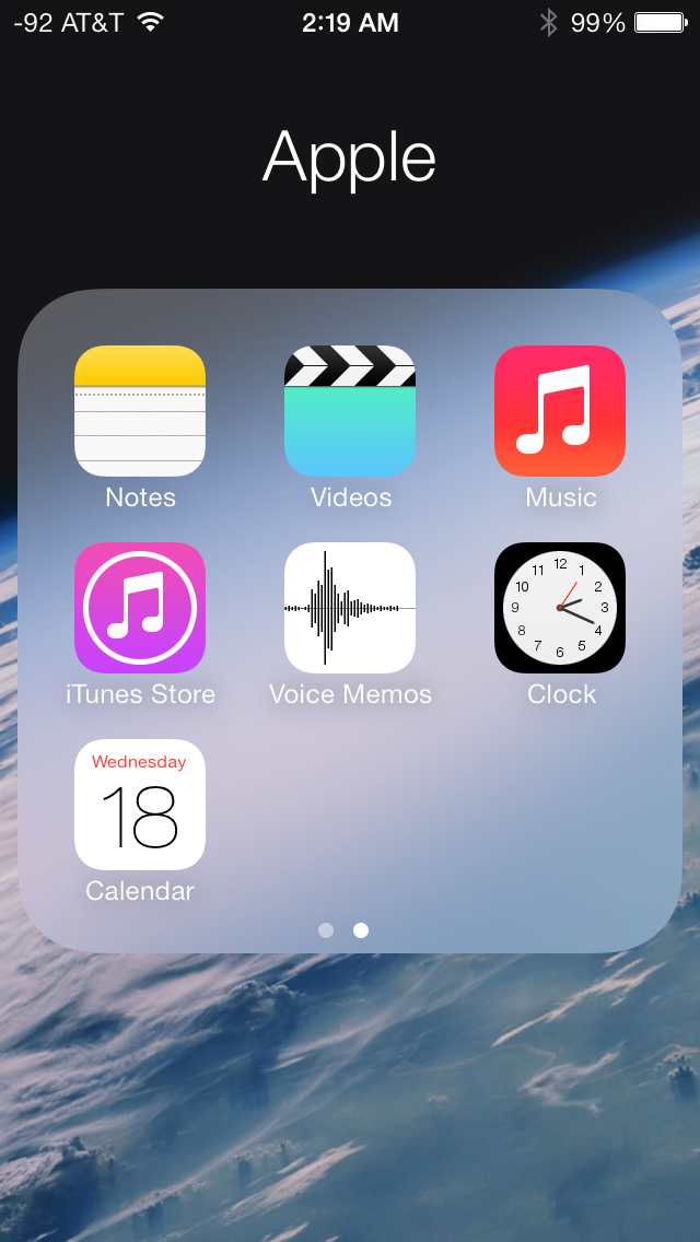
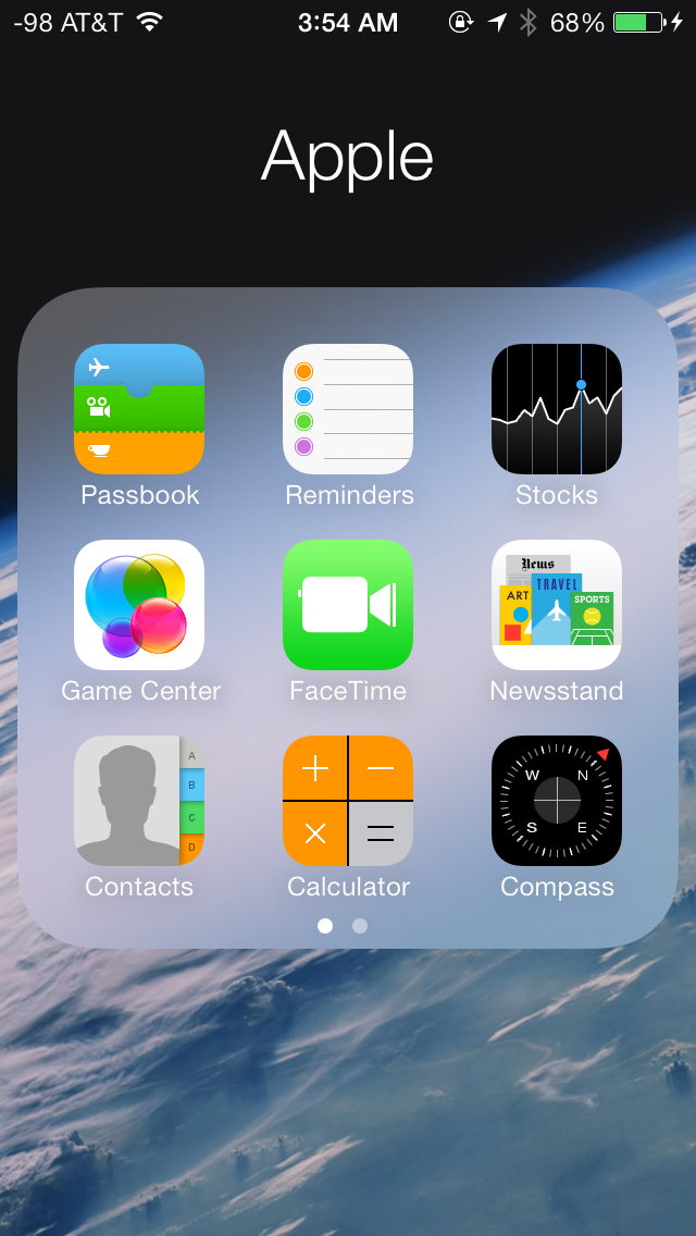
The new dock has a frosted transparent look, and adapts to the current wallpaper, much like other parts of the OS such as the Notification Center and Control Center. Folders have also been completely revamped, but look rather bland and uninviting. Again, the folders adapt to the current wallpaper, which should keep things fresh in the long-run from a UI standpoint. Once accessed, a folder fills up the entire screen and now supports multiple pages of apps. The home screen adds support for dynamic wallpapers, a few of which come bundled with the OS itself, but there’s no word yet on support for custom dynamic wallpapers. Swiping down from the top edge of the screen provides access to the revamped Notification Center, whereas swiping up from the bottom edge provides access to the Control Center. Spotlight can now be accessed by swiping down anywhere (anywhere but the top edge, or the dock icons) on the home screen. The Spotlight UI is a light gray, frosted, transparent overlay on the home screen. Results are categorized by apps, and display additional information such as an icon for unread email or a line which says “completed” under reminders.
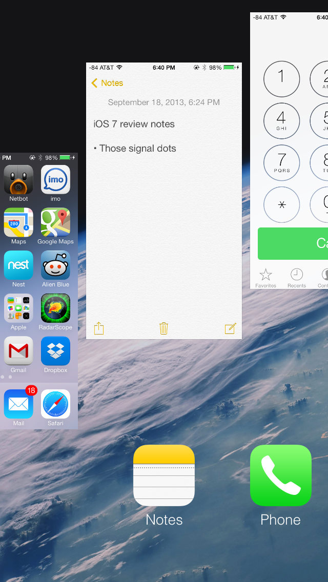
iOS 7 features a completely revamped multitasking interface which is similar to the one adopted by webOS back in the day. Double pressing the home button zooms out of the home screen to display a full screen preview of all running apps with the app icon below the preview. From here you can switch between apps by tapping on their window preview or the app icon below it. You can manually quit apps by swiping their preview windows up, you can even swipe multiple windows off at the same time. You can’t however switch to or quit an app by tapping on any of the windows while the multitasking view is in motion; you have to wait for all windows to come to a halt before you’re allowed to interact with any of them. The app icons themselves are fair game, but otherwise this is a waste of an otherwise very quick animation.
There are some orientation quirks that need to be worked out, for instance, if an app is currently in landscape mode, the multitasking interface orients itself correctly in the landscape mode, but the previews for other running apps running in portrait mode appear rotated 90 degrees, making things slightly disconcerting on the eyes. Another thing I noticed (because the sleep/wake button on my iPhone 5 is defunct), is that Assistive Touch is not available in the new multitasking interface.
The design and color scheme of the new icons have been a subject of much debate with opinions spanning the entire possible gamut. The new icons are a stark departure from the glossy, texture-ridden icons used so far. Personally, I found the new icons to be excessively simple, and the color scheme to be a tad bit garish for my liking. While I’m quite comfortable with the big rounded edges and the flat appearance, I feel some of the icons don’t quite convey the purpose of the apps. Icons for the Photos and Game Center apps are prime examples, because if it weren’t for the text underneath, it would be impossible to figure out what the app is supposed to do. Icons for the Stocks and Voice Memos app are also overly simplistic and don’t convey much about the app’s purpose. Icons for the Calendar and Music apps are quite well designed in my opinion, but it all boils down to personal preferences. That being said, I strongly feel the new icons and color scheme will garner an extremely polarizing response from the general public, much like the one from the beta testing community.
Multitasking API Changes
Although iOS added multitasking support a long time ago, there still are a few pain points in the multitasking workflow that get smoothed over in iOS 7. In iOS 6, applications could request a certain amount of time to complete a task or run in the background state, after which point the background task ends and the iPhone goes to sleep. Push notifications and other things can give the impression that the application is still awake, but that background process really is finished.
In iOS 7 there are two new multitasking modes. The first addresses a pain point that I’m sure many other iOS users have encountered with third party messaging applications that deliver messages as push notifications and also in an app. This new mode allows applications to fetch new content in the background when a push notification comes in, rather than doing it when the user launches the app in response to the notification arriving. I run into this all the time with my IM client of choice, for example – push notifications will come in with the messages, but the app is unaware until it actually gets launched, after which it pulls down what’s new.
The second mode adds supports for periodic background content fetching for apps that update their content on a schedule. This allows apps that request content periodically to get background execution time so that information is already fresh and pulled down when the user launches it.
iOS 7 also now changes up the background task scheduling system so that applications that do run in the background opportunistically do so during other periods when the phone is awake and screen-off. The reality is that the iPhone (and really all other smartphones) are waking up all the time while they’re suspended and either fetching content or doing some processing, using this time to complete some other task is what’s new in iOS 7 as well.
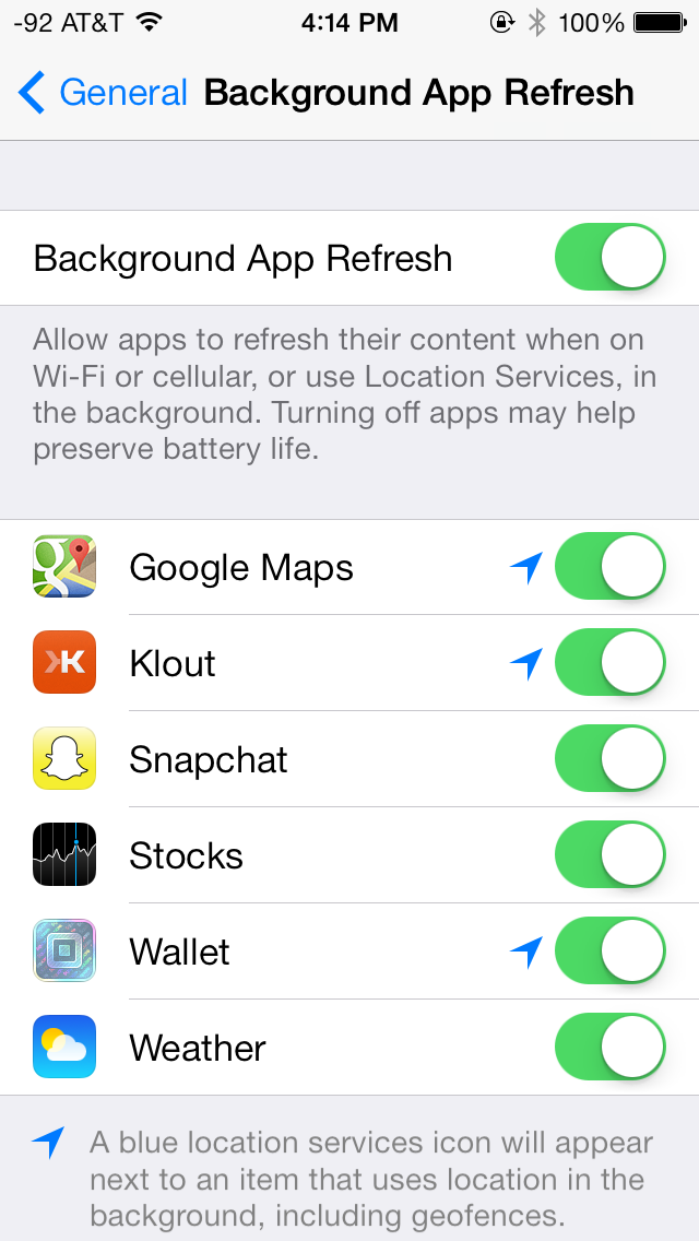
App developers can opt for these new background states, but they aren’t necessarily used. Based on launch pattern (frequency and time of day) for applications, over time iOS 7 learns what apps a user is using and when, and schedules those background events accordingly. Users can of course just disable the functionality entirely under the background app refresh menu in settings.
Keyboard Design
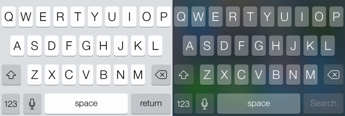
The default keyboard has also been revamped with the new typography and a white or dark gray color scheme, depending on the app. The keyboard also takes advantage of translucencies, much like other UI elements such as the status bar and the action bars in apps, inducing a sense of depth and functional layers in apps. Apps that support the new keyboard must be updated to draw their view behind the keyboard now, enabling a pretty cool visual effect. The new keyboard looks great and compliments the rest of the OS beautifully. Third party apps that haven’t been updated currently don’t use the new keyboard design.
Functionally the new keyboard works a lot like the old one, although there are some weird changes that detract from the overall experience. For starters, all keys are still labeled with capitalized letters regardless of whether or not you’ve toggled the shift key. Pressing shift just toggles an indicator on the virtual shift key, the letters themselves don’t change their appearance on the keyboard. I don’t need to explain how this may be a stylistic improvement but is definitely a functional difference between iOS and Android. Although Apple seems fundamentally opposed, it'd still be great to someday get the ability to use third party keyboards and enable swype-like typing.
Autocorrect is seemingly unchanged, although I do find myself making more mistakes on the new keyboard compared to the previous version. There’s visually less spacing between the keys, which seems to have an impact on my typing accuracy. Whenever I switch to a third party app without the updated keyboard view I typically find my accuracy goes up. I’m sure it’s something I can get used to, but definitely a change and not necessarily one for the better (at least, again, from a functional standpoint).
Camera
I touched on the new camera interface in my iPhone 5S camera improvement thoughts piece already, but it’s worth talking about again. Camera UI seems to be something that every OEM is changing quickly, and while there are common elements shared between the various camera UIs out there, there’s really no common design like there is say for threaded messaging or a dialer.
The camera UI gets probably one of the more dramatic overhauls in iOS 7, and fixes a lot of things that were slowly becoming a problem as Apple added camera features to its platforms.
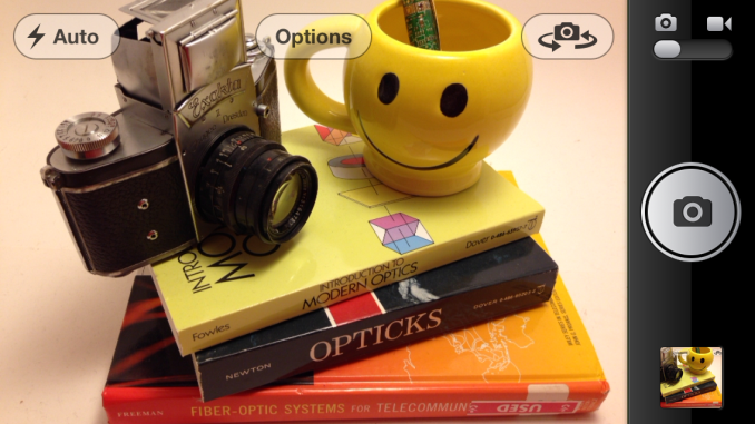
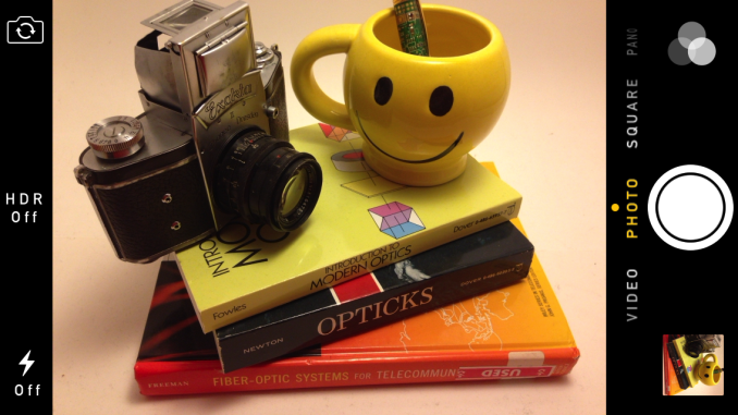
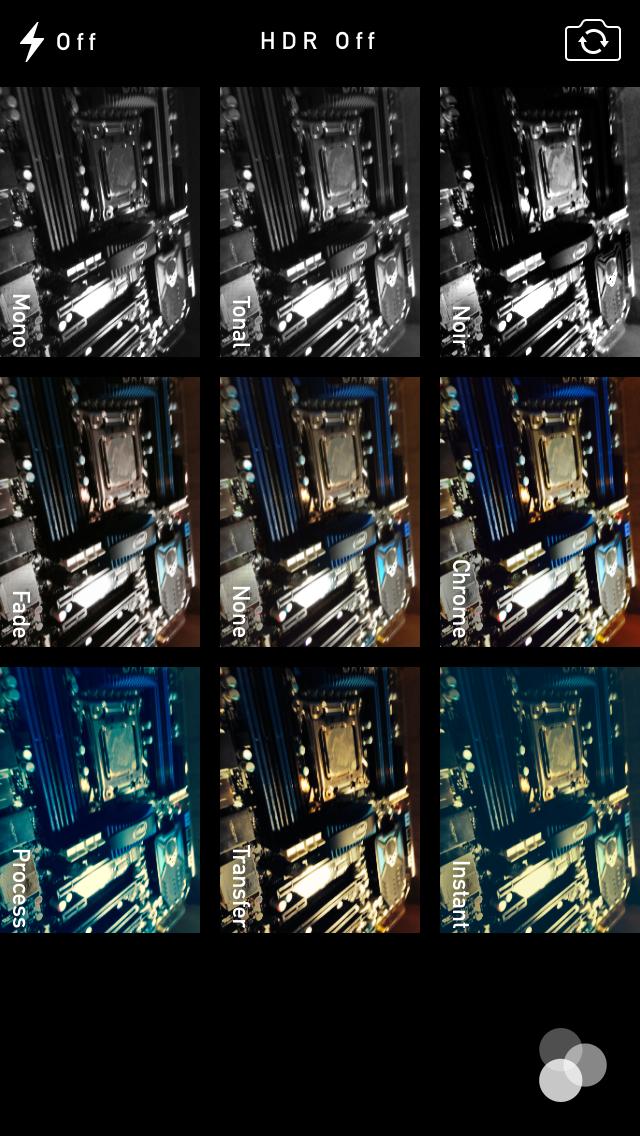
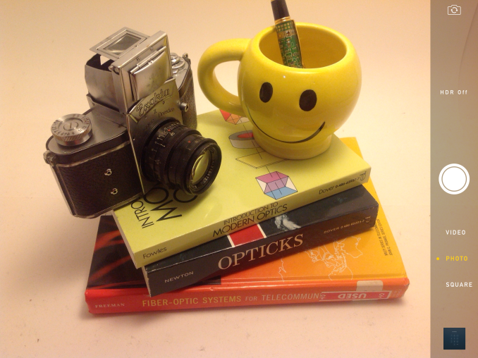
The camera UI has completely different iconography and styling from the old one. Gone is the video toggle, and in its place is a mode ring which switches between slow-mo, videos, photo, square, and panorama. This eliminates some of the feature cruft that was piling up in the “options” button from the old UI. There’s also the filters option which shows a live preview grid of some filters on the image – think photo booth for iOS. My only complaint is that whereas the previous iOS camera UI had more visual cues that made it easy to confirm the camera detected proper portrait or landscape orientation, the iOS 7 camera really doesn’t. Only the thumbnail and flash/HDR/front camera icons rotate. Further, the text ring switcher doesn’t rotate, which adds some mental processing when you’re shooting in landscape (which you should, especially for video).
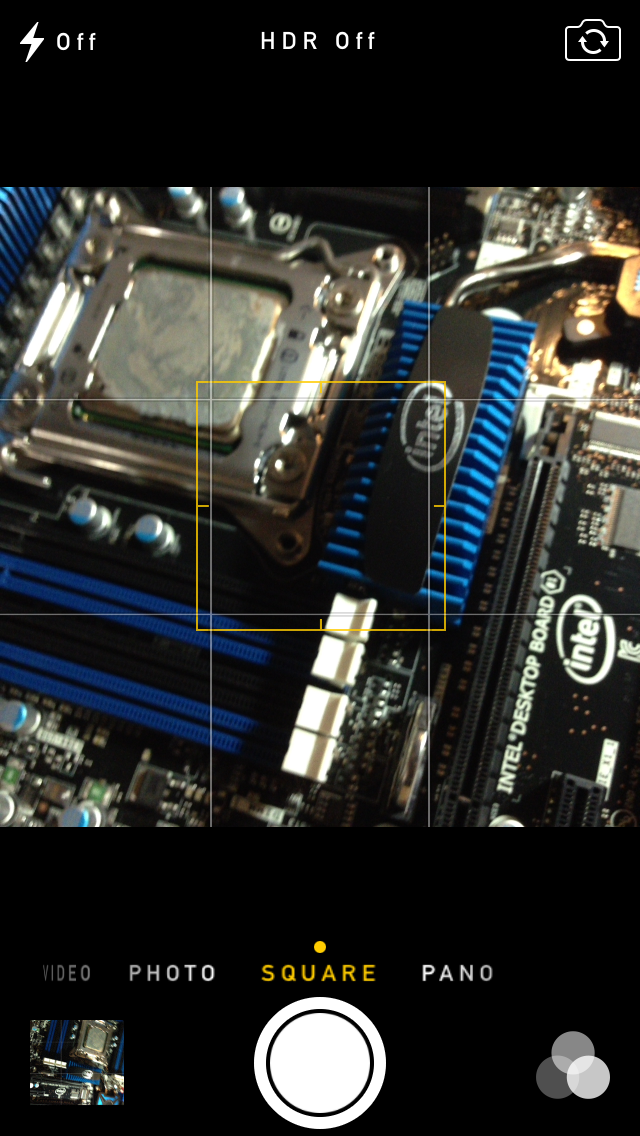
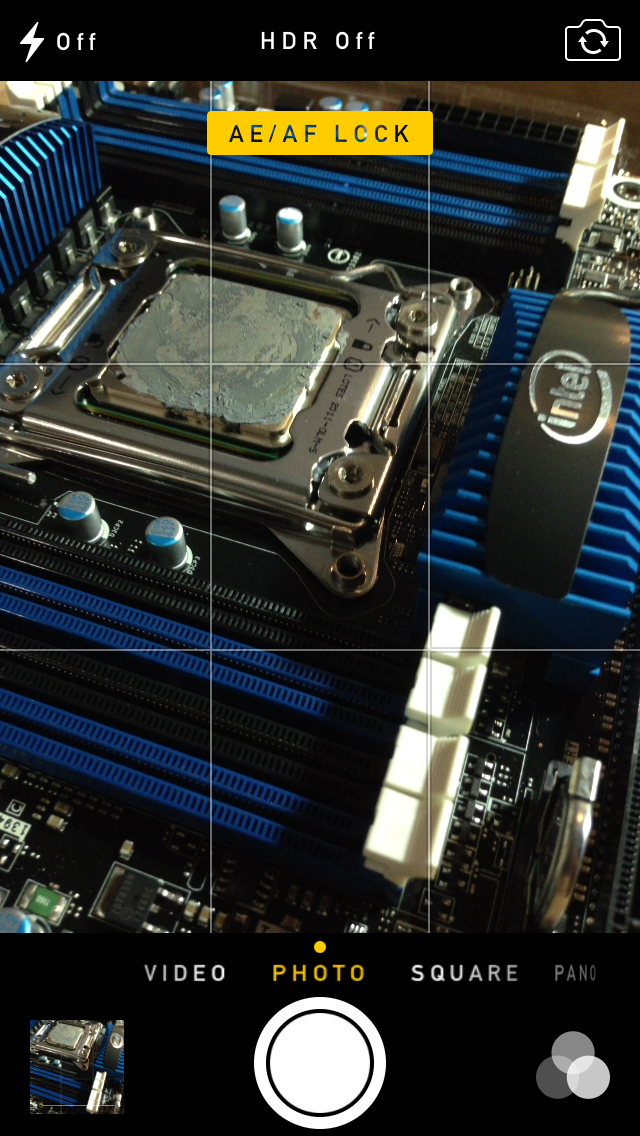
A major problem with the iPhone 5 and iOS 6 camera UI was the aspect ratio mismatch between the camera sensor and display, and the way Apple chose to deal with it. This has become a problem for other OEMs as well since then. The live preview previously was fit to the long axis of the display, chopping the top and bottom of the actual image area off. This hilariously results in a preview that doesn’t actually show what the output image is going to look like, and composition matters when taking photos.
The good news is that in iOS 7 Apple has changed it so the image preview is now aspect-correct without cropping of the image preview. The bad news is that it took a whole iOS release cycle to fix that problem, which is curious considering that problem existed for video already (video is 16:9) on previous iPhones without 16:9 displays and Apple just implemented a double tap to show the full field of view.
On the iPad the camera UI changes slightly, there’s no ring switcher but just a strip with text for the ring switcher and all the controls.
The camera UI still retains AF/AE lock (long press in the preview) and the rule of thirds grid (although this is under settings, outside of camera.app), what’s different is holding the capture button now bust captures on every platform. Previously you could hold the camera button down indefinitely and capture on release, which was great if you wanted to take a selfie with the rear facing camera (just hold it, then release).
Apple has taken the extreme automatic route with its camera UI, you won’t ever see a Nokia 1020-esque UI with optional manual controls for ISO, focus, or exposure time, so getting everything right is very important. I’m really happy that the new UI fixes the aspect ratio cropping issue which was alarming to see shipped on the iPhone 5.
Photos
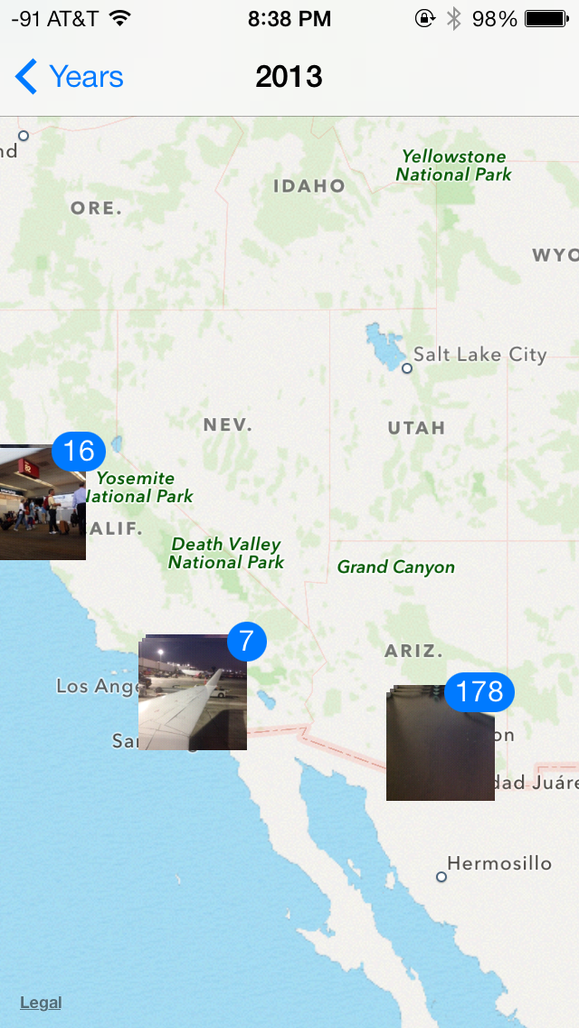
The Photos application gets an entirely new icon and a number of overhauls inside. In addition to the Albums view there’s a new Photos view which has a few different visualizations and groupings – collections, years, and moments. These group photos together based on time or place in a logical fashion.
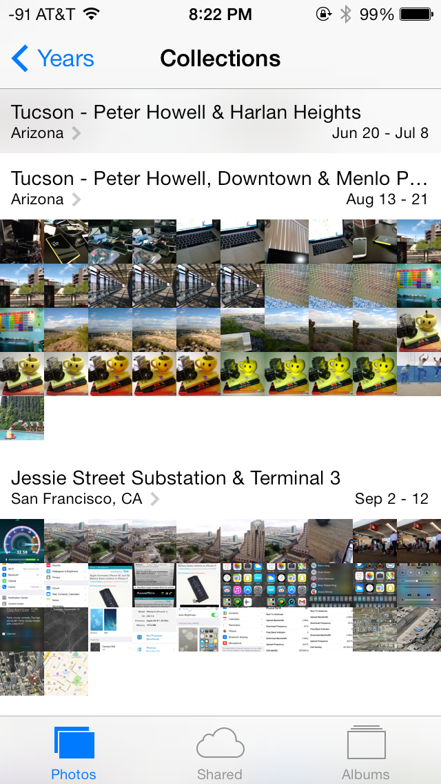
The visualizations show small thumbnails with all the photos automatically grouped together. This is a big step forward from the oldest at top, newest at bottom organization that the albums view provided with fixed size thumbnails that quickly became impossible to navigate after getting a few thousand images in. There are some new multitouch effects in this view too, you can pinch and zoom into images from the moments views and flick them around. The maps view is also still around, which uses the location tags from EXIF.
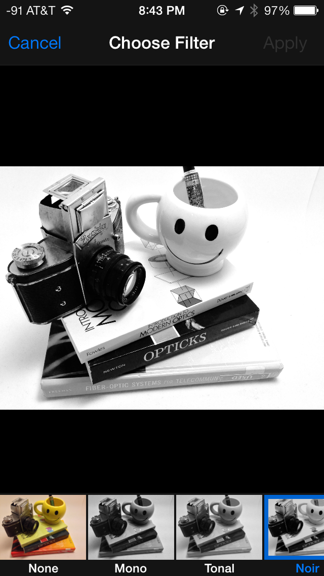
Inside the edit menu there’s also new support added for photo filter effects after the fact. In addition photos taken with the filter toggled don’t actually destructively change the original image, so you can remove these or change them after the fact. I’m not a big filters person but this kind of nondestructive editing is awesome.
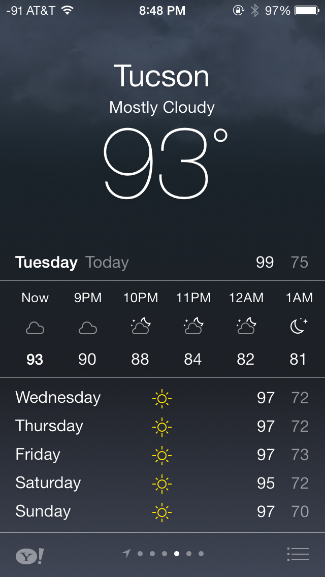
Weather
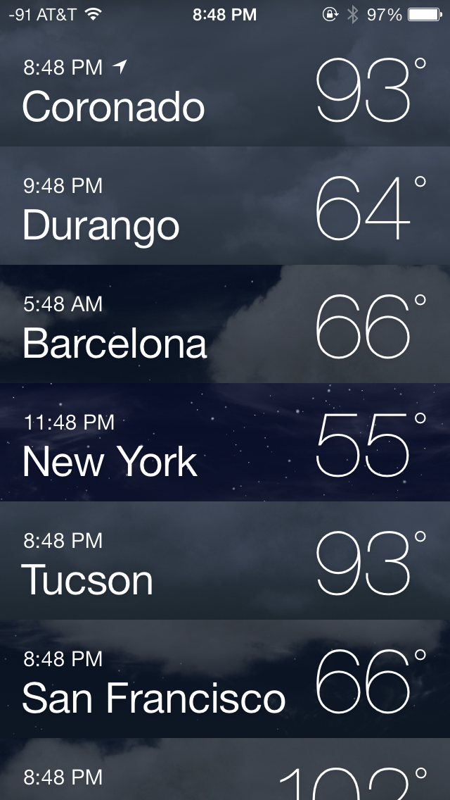
The weather app is probably the purest expression of the design elements that Apple wants to convey with iOS 7. There’s parallax, edge to edge views, and the same typographic emphasis that exists elsewhere. Where the previous weather app was really an extension of the long-forgotten dashboard widget from OS X, the weather app in iOS 7 is something of a style guide example app from Apple for third party developers.
What’s more, gone are the rules and icons that used to hint at things like deleting elements or rearranging them. Instead swiping or dragging does exactly what it should do. Functionality doesn’t change much, but it’s visually very different from what came before.
Compass and Level
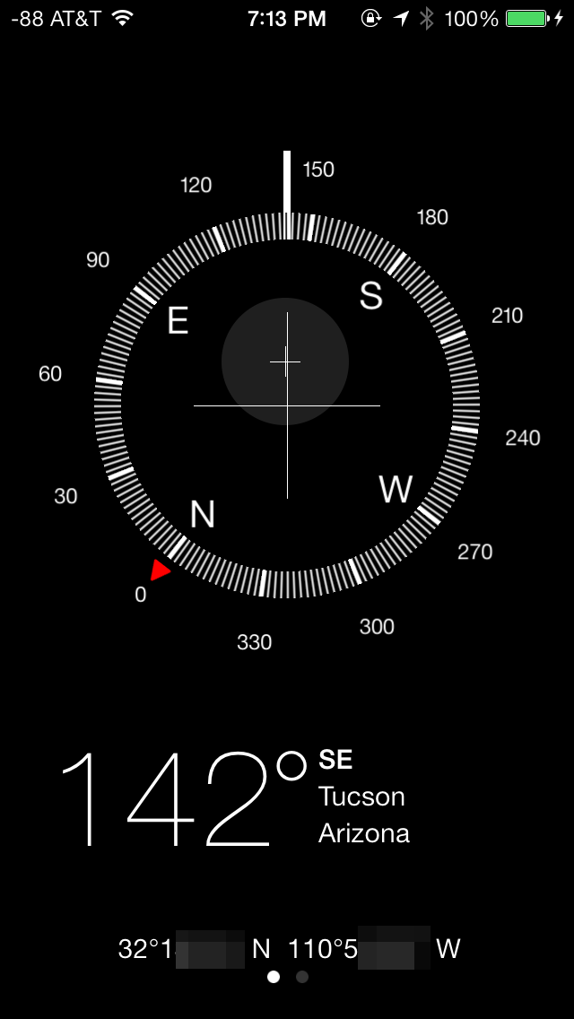
Another first party app with a dramatic change is the compass application and level indicator. In iOS 7 Apple turns what was a marginally useful demo application added to showcase the MEMS compass added a long time ago to the iPhone platform into a useful level and location tool.
Apple made a big deal about the weather.app changes, but I’m more excited about seeing more designs that follow the kind of design that the compass app lays out. It’s shocking how different the new design looks when compared to the old one.
Calendar
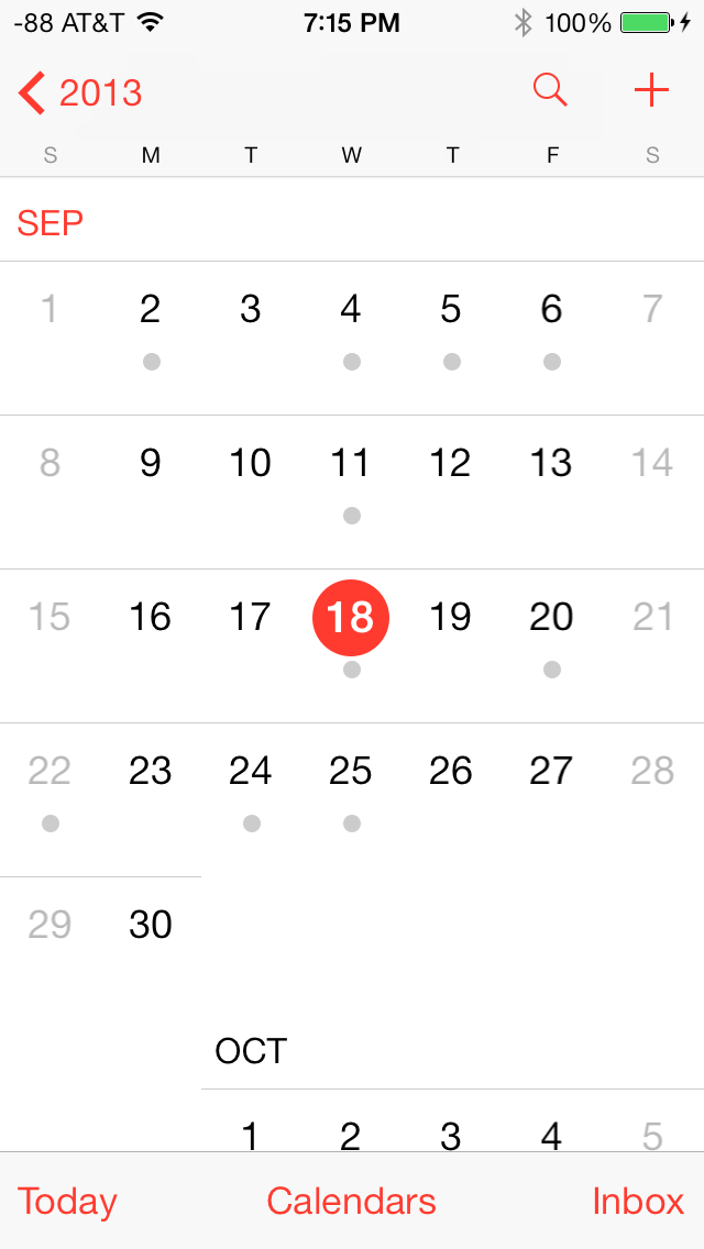
The redesigned Calendar app is quite possibly my favorite app in iOS 7. The interface is extremely clean and makes great use of a red and white color scheme. The animations to transition between portrait and landscape mode are fluid and in general, the new Calendar app is very pleasing to use.
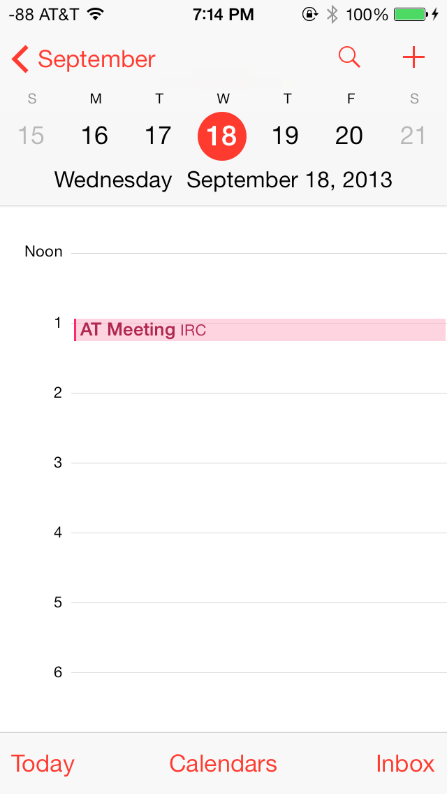
In portrait mode, today’s date is highlighted in red, and days with scheduled appointments can be easily discerned by the gray dot underneath the date. The bottom bar lets users select their calendars and manage their appointments through the inbox, whereas the top bar can be used to quickly search for appointments and create new appointments.
In landscape mode, the app defaults to a 5-day week view. Swiping horizontally across the top bar scrolls through the days, whereas scrolling horizontally shows the appointments on a particular day in that week. The day view in portrait mode is similar, but only shows appointments for that particular day.
Clock
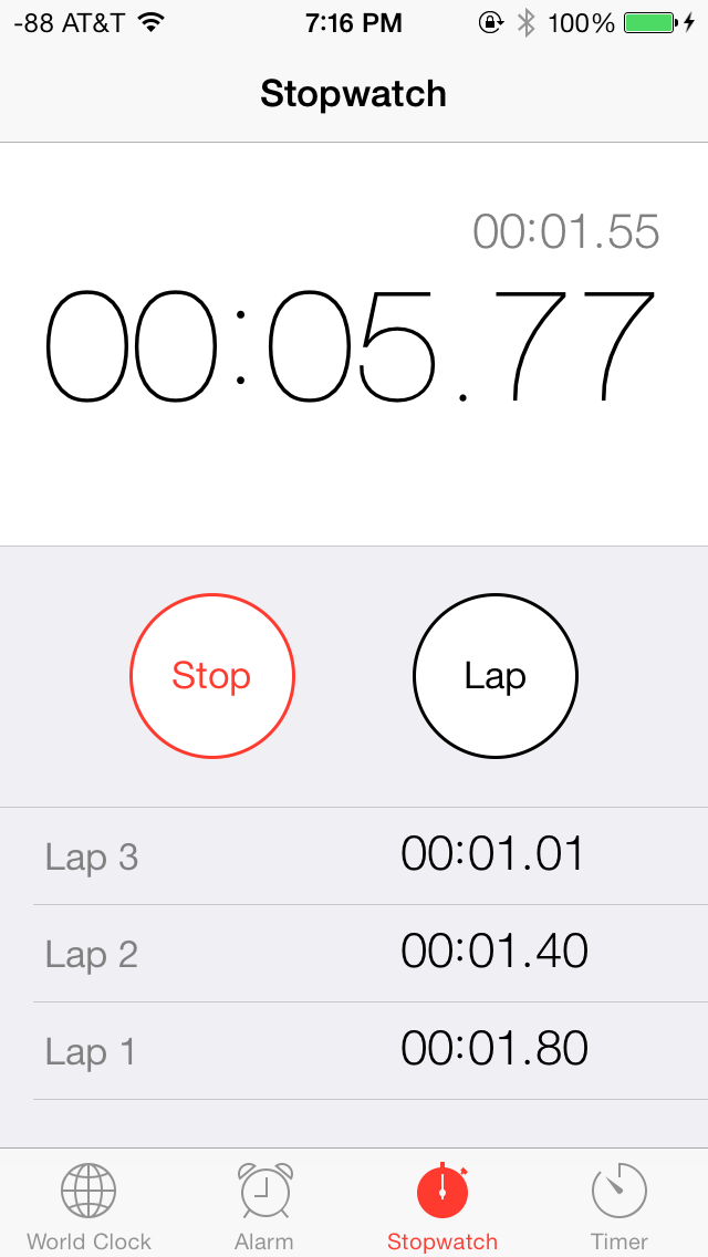
The Clock app has also received an aesthetic facelift and shares a red and white color scheme with the Calendar app. The World Clock tab can display up to five cities on one screen on iOS devices with 4” screens. The city names appear in a large font and are very easy to read. Based on the current location, the relative date and the time difference is displayed below each clock, which is an extremely useful addition to the app. The time display can be toggled between analogue and digital by tapping anywhere on the screen. The analogue clock faces also change color depending on the time in that particular city.
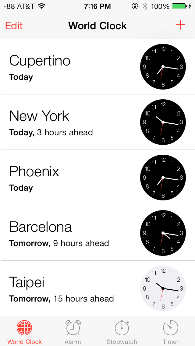
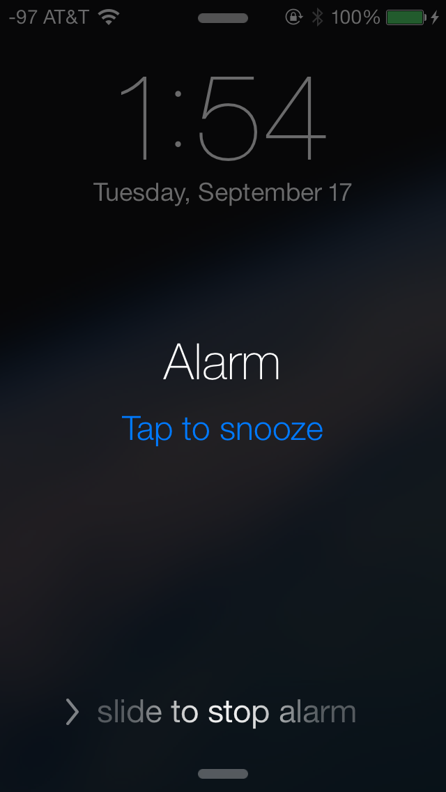
The Alarm tab is largely unchanged and has only been updated with iOS 7 UI elements. The fonts again are large and easy to read, and the alarm mechanism has been beautifully integrated with the lock screen. When an alarm goes off, it can be snoozed by tapping on the home screen, or dismissed by sliding across. If the alarm is snoozed, a 9-minute snooze timer automatically appears as an active countdown on the home screen. This is yet another example of an ingeniously implemented feature in iOS 7, one which has given me the ability to snooze with confidence.
The Stopwatch and Timer tabs have also received a facelift, but retain their core functionality.
Contacts
The Contacts app has seen steady refinement and new features in each release of iOS, and as such, is an already robust app. The standalone Contacts app and its counterpart in the Phone app feature a blue and white interface in iOS 7. The layout for “All Contacts” remains unchanged, but the individual contact pages now feature a cleaner and more simplified layout. The top is dominated by the contact name and rounded portrait, which is displayed next to the contact name in the Favorites tab of the Phone app.
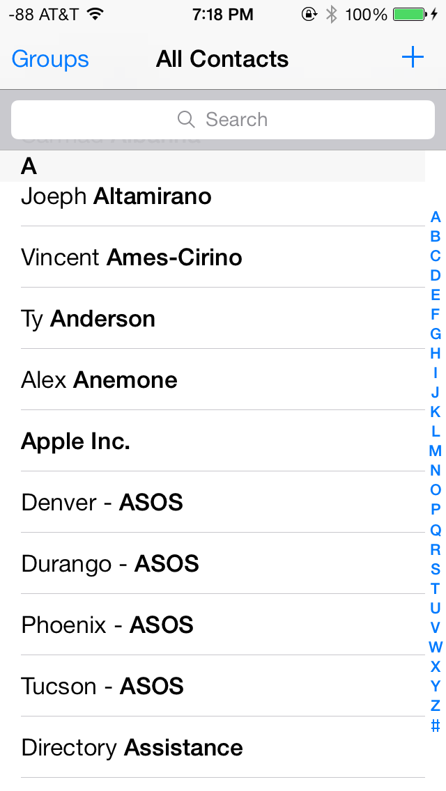
Phone numbers have a call and text icon next to them, to quickly initiate either, directly from the contact page. The edit page also has a clean layout, with bright red and green buttons to add and delete fields. One notable addition is the ability to link LinkedIn contacts, which have now been fully integrated into iOS 7.
Notes & Reminders
The Notes app takes on white and yellow color scheme, and retains an identical interface to its iOS 6 counterpart. The background is white and has a slightly textured look, updated with the usual iOS 7 UI elements.
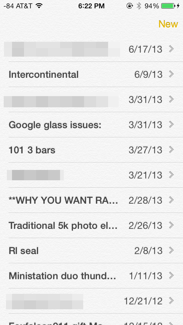
The Reminders app also shares a textured white background, but also has some transparent gray UI elements. The app has a card interface and lets users toggle between lists and scheduled tasks. List and scheduled tasks stack up, and can be navigated similar to navigating Passbook. A search bar on top lets users search for tasks and reminders. New lists can be color coded.
Game Center
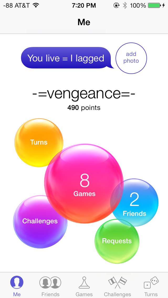
Perhaps the one thing that immediately stood out after looking at the Game Center app is its icon, its unique to say the least. Apple has gone with an indigo and white color scheme for Game Center. The Me tab has your username and portrait at the top and bright neon colored blobs hovering on the screen. These look great against the flush white background, but do not serve any other purpose, other than letting users toggle between the tabs below.
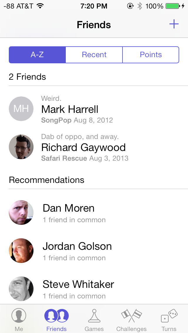
The Friends tab shows your friends (duh) and recommended friends based on your contacts and Facebook friends. The Games tab shows all your current Game Center games, and recommendations based on downloaded games and App Store top lists. Challenges from other friends and notifications from turn-based games show up in the Challenges and Turns tabs respectively, moving on.
Music
The Music app also uses a red and white color scheme and has been completely revamped in iOS 7, making extensive use of transparencies and featuring a new album art wall in landscape mode.
The top bar in the Music app always displays a link the Music Store and Now Playing, regardless of the current tab. Of course, the track details, volume and navigation controls are also available at anytime in the Control Center. The Playlist tab shows local playlists on the device, and playlists on shared iTunes libraries. Creating new playlists is easy, and tracks can be mass added in one go. The Playlist tab only displays the name of the playlist, but does not give details about the number of songs or the total duration of the playlist. This could be a helpful addition in a subsequent release. Local playlists cannot be created if connected to a shared iTunes library.
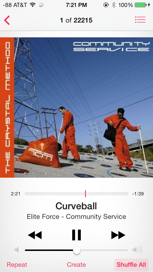
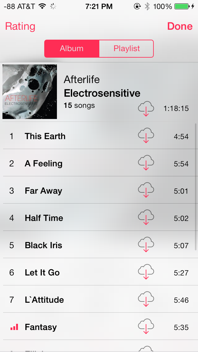
The Artists tab has been revamped with large album art, which is now omnipresent. Albums without album art just show a gray box with the album and artist name. The number of albums and songs display below the artist name, which is a useful addition. The Songs tab also displays album art, but smaller, compared to the Artists tab. The currently playing track shows a cool three bar equalizer animation, in addition to a download icon, in case you are streaming from iCloud. The Albums tab is similar to the Artists tab. The More tab lets you customize tabs and tab layout with Genres, Compilations and Composers.
The Now Playing screen is dominated by album art, and features the usual controls in the bottom half of the screen. However, the perfectly familiar icons for Repeat and Shuffle popularized by iTunes, have been replaced with text labels. I don’t quite understand the rationale behind this change. The Create button is also present to quickly create a Genius Playlist based on the current track.
App Store/Music Store
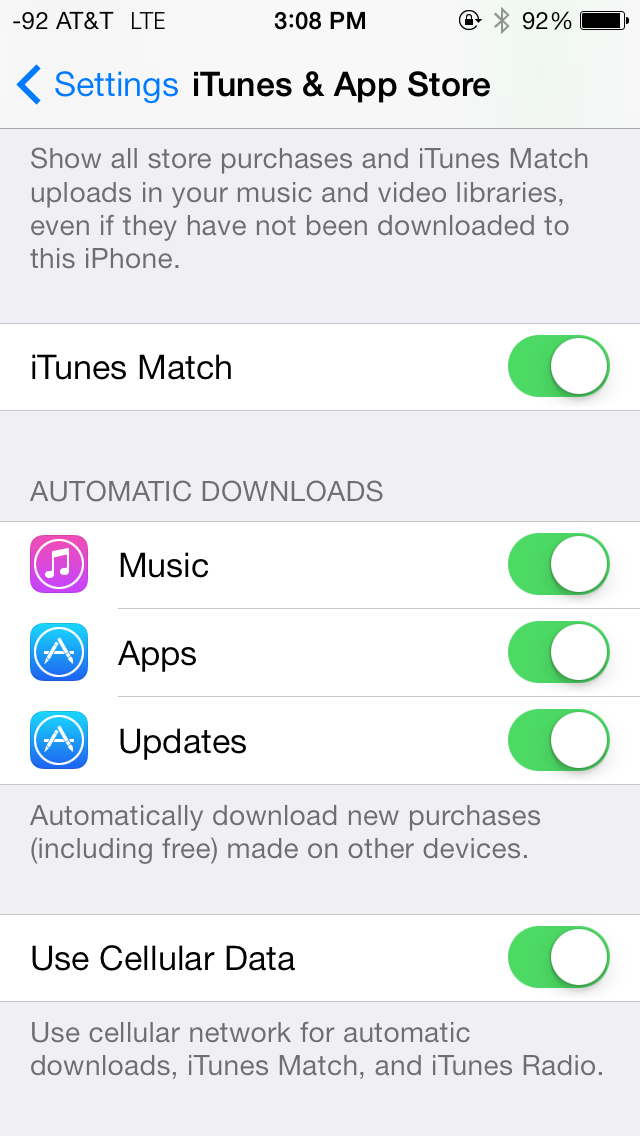
iOS 7 introduces a number of new features for the App Store, but Apple has not tampered too much with the app’s design. The UI has obviously been updated with a cleaner white and blue interface, and featured frosty white transparencies, similar to the Messaging app. With the new App Store on iOS 7, Apple has finally addressed one of the most requested features, which is to enable automatic updating for apps. Apps now update automatically, and the updates tab provides an informative log of the updated apps, new features and bug fixes in that release, and the date on which the app was updated. The home screen also has a new animation while apps are updating, and recently updated apps can be easily spotted by a blue dot next to their names. Newly downloaded apps no longer have a ribbon on their names.
The App Store also lets users maintain a Wish List, which can be easily accessed from within the app. This has been universally rolled across all three stores. Everything offered for sale across the App, iTunes and iBook stores can now be added to a Wish List. Finally, there’s also a new location-based feature to see apps that a popular nearby, which is a pretty nifty feature to access popular apps, especially if you are traveling.
Messaging
The Messaging app looks beautiful on iOS 7. The bright green and blue colors for text messages and iMessage, coupled with subtle transparencies and the new keyboard make the Messaging app the benchmark for how native iOS 7 apps should look.
The top bar lets users quickly call the contact or look up their contact page and swiping left across a message reveals its time stamp, which is quite useful. Message bubbles also change color gradients depending on their position on the screen, which is looks great on the white background. Finally, swiping right from the left edge of the screen takes you back to the messages list, something we saw more recently on BB10. Finally, the Messaging app supports nicknames, which can be defined from Settings under Mail, Contacts, Calendars.
The Mail app has gained some very useful features in iOS 7 along with a brand new interface. Perhaps the biggest new feature is the ability to add smart mailboxes. On the Mailboxes screen, tapping the Edit button now allows users to display flagged or unread emails, emails with attachments and sent, draft and trashed emails across all accounts. This is a huge improvement from iOS 6 and one that users will truly appreciate. The pull down to refresh animation is replaced with something much more subtle. Search is now universal across all mailboxes, regardless of the mailbox where the search is initiated and seems snappier. The Mail app now highlights the search string in the search results as well, which is a very welcome addition. Moving messages is also easier, displaying a preview thumbnail of the message, and the account it was sent to.
Share Screen
iOS 7 has also implemented a brand new share screen which adapts based on the app being used and the content being shared. It takes up the entire screen, and offers numerous options to share content. For example, in the Photos app, the share screen lets users select multiple photos and videos and share them via AirDrop, or other apps such as Messaging, Mail, iCloud Photo Stream, Facebook, YouTube or Flickr. Also included are contextual, app and content-specific options such as ability to start slideshows, stream via Airplay, copy, assign to contact and many more. For example, the assign to contact option only is available if a single picture is selected, and not when multiple pictures, or a video is selected.
Phone
As with other apps, the Phone app has seen a steady stream of updates and new features in past releases, but has received its biggest update yet in iOS 7.
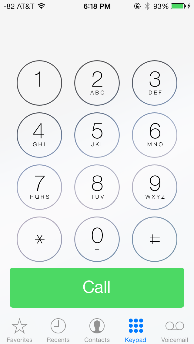
iOS 7 (left), iOS 6 (right)
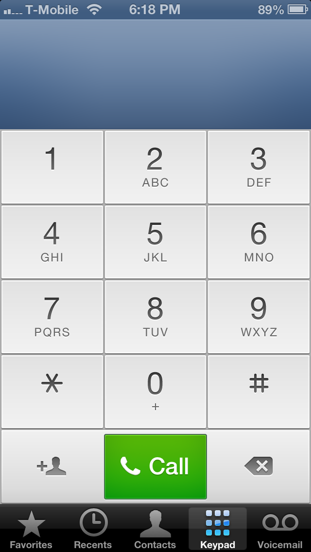
Like a lot of the other core apps, the Phone app also has a predominantly blue and white interface. The Favorites tab now shows circular portraits for people with pictures, or just an abbreviation of their first and last name for those who don’t. This is also applies to search results in Spotlight. Apart from changes to the Contacts app, covered earlier in this review, Phone app is functionally largely unchanged. The biggest change is to the Keypad tab, where the dialer has been replaced with round buttons with transparent borders that show the wallpaper underneath when tapped.
Once a call is made, the six familiar in-call options have also been replaced with rounded buttons. Contacts with pictures look great during incoming calls, but feature a frosted transparent overlay while making calls. Incoming calls have bright decline and answer buttons, with the remind and text back options above them. I’m not a big fan of the bold font used for the call, decline and answer buttons, it just doesn’t gel with the non-bolded font used elsewhere in the Phone app.
App Store
A major thankful change in iOS 7 is the ability to have applications automatically update as updates are pushed to the store.
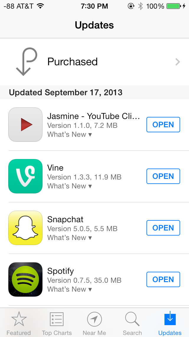
Rather than just let these pile up and procrastinate, if you enable this feature apps update on their own. Users can still browse the changelogs by going into App Store and clicking on the drop down, or viewing version history under the application listings themselves. This is an awesome change I'm very happy to finally get in iOS.
Finally iDevices associated with an iCloud account now require users to enter their iCloud password upon recovery or restore as part of the activation process. If you wipe or DFU mode restore an iDevice without signing out first, you'll get a prompt during setup. This feature does diminish the ability for would-be theives to be able to quickly turn around stolen iDevices, as they simply won't ever activate without the password.
Settings
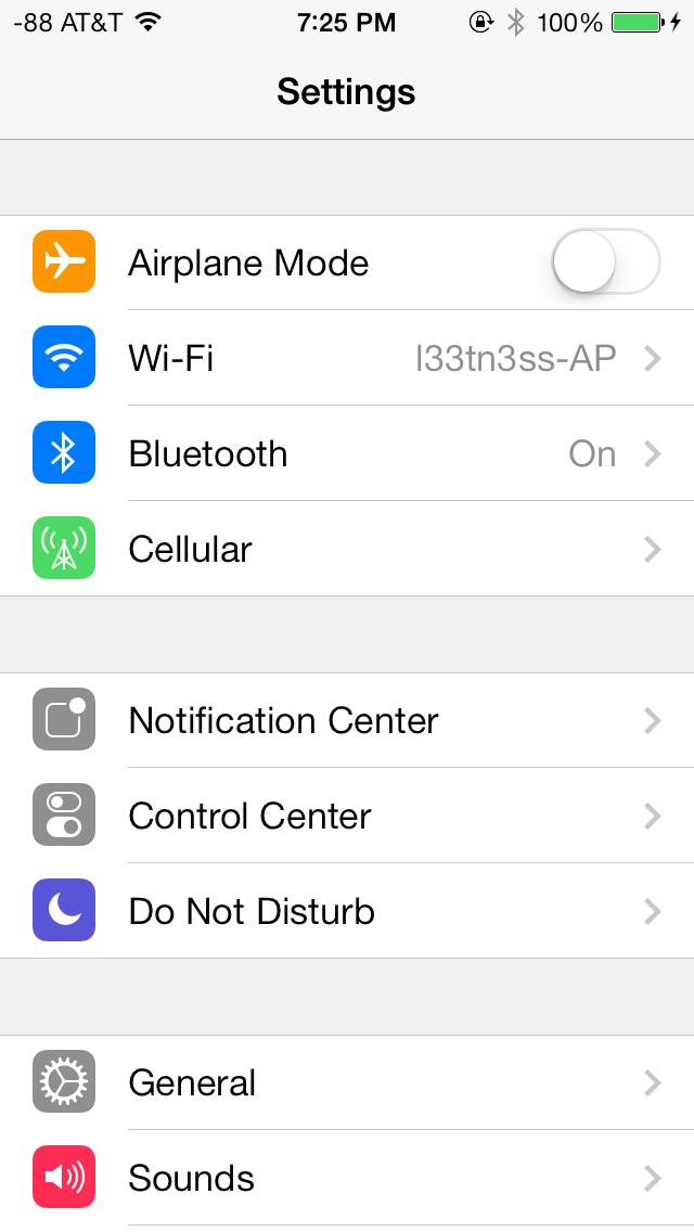
The changes in Settings.app are primarily visual at a high level. The application icon is perhaps the most curious change, since it looks like a sprocket for a bicycle or the gears inside a watch now, but I digress. This new UI pretty much just has visual style that matches the rest of iOS 7, and doesn’t really fundamentally change organizational structure very much. Settings are still grouped together in a couple of logical little bunches, with a bunch of third party application-specific settings options at the very bottom.
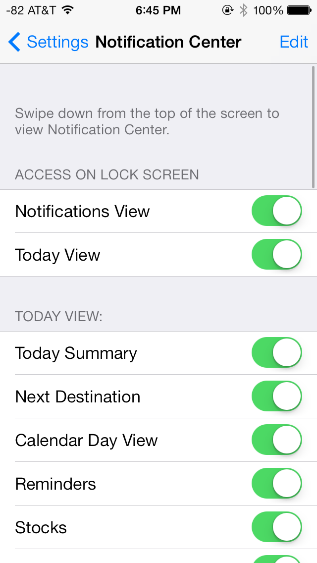
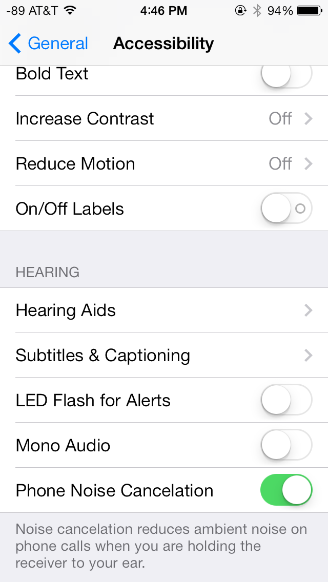
There’s obviously the addition of control center inside settings, and do not disturb comes outside of notifications. There are also the appropriate toggles for the today view under notification center. Under general and accessibility there are new options for the dynamic font size functionality, and a new toggle for disabling noise cancelation which proved somewhat controversial on the iPhone 5 (this setting also carries over to the 5s but not the 5c which I suspect lacks earpiece noise cancelation).
Safari
iOS 7 brings mobile safari version 7, which gets a huge set of functional changes and improvements to the JavaScript engine. Safari has been around for a while without many big changes to the interface, so this is big one.
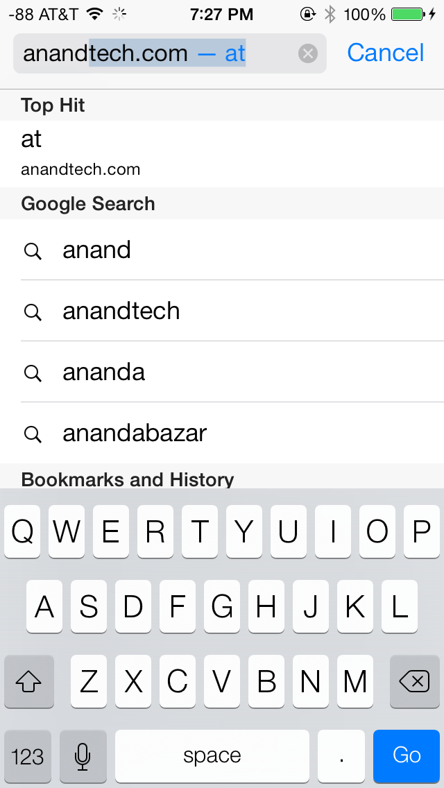
There’s now a unibar at the top of the page for both URLs and search terms, this is a long overdue and welcome change that makes a ton of sense. Safari also now preloads the first result in the list while you’re typing, which has the side effect of making loading feel much faster regardless of what device you’re coming from.
The unibar also looks through bookmarks that are either synced through iCloud or exist on the iDevice and exposes those as options. It’s a bit confusing though since there are both the bookmarks under that appropriate menu, and bookmarks from the bookmarks bar that appear when you tap on the unibar on an empty tab before you start typing. I didn’t realize I even had some of those bookmarks still around until iOS 7 swung around and exposed them.
The new mobile safari gets the same transparent overlays and sense of depth that the rest of the OS conveys, the pages render below most of the UI and there’s a bit of hinting from elements that peek through. A big change is that the bottom menu now also slides away as you scroll down a page, expanding the viewport accordingly. The top bar gets smaller but retains the domain of the page being visited. Tweaks like these do help the iPhone feel bigger than it used to feel.
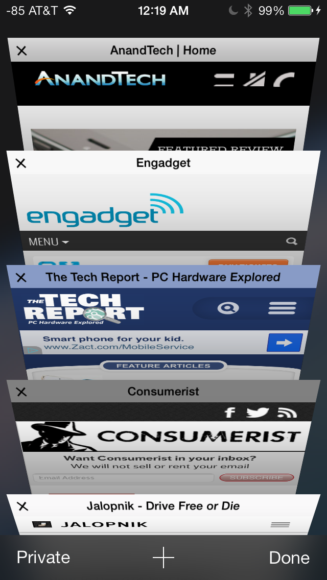
In addition you can now have more than 8 pages open at the same time, and safari seems a lot better at keeping tabs around and not reloading their contents every time you switch between them. The tab switching interface is also a lot better, with a card-like metaphor that allows for tabs to be quickly closed by just swiping them off the left of the display. The only slightly unnerving issue here is that the tabs aren’t antialiased during the animation and for a slight moment or two after it stops, then suddenly the edges no longer have jaggies. It’s a disconcerting subtle thing I can’t stop seeing every time I change tabs in the new mobile safari.
If the signal dots are my least favorite part of iOS, then the changes made in mobile safari and the addition of control center are my favorite.
Benchmarks
Apple usually makes improvements to its JavaScript engine (Nitro) whenever it can, and the iOS 7 mobile safari release is no exception. There’s a 15 percent difference in sunspider and browsermark, and a larger one closer to 50 percent in kraken and google octane, webxprt sees a 30 percent jump. This is comparing two iPhone 5 models running iOS 6.1.4 and the iOS 7.0 GM. HTML5 score increases as well with the addition of a few new features, and WebKit moves from 536.26 to 537.51.1.
| iOS 6.1.4 | iOS 7 GM | |
| Sunspider 1.0 (ms) | 836.6 | 721.1 |
| Browsermark 2.0 (score) | 2587 | 2998 |
| Kraken 1.1 (ms) | 20388.0 | 14050.6 |
| Google Octane (score) | 1706 | 2856 |
| WebXprt (score) | 176 | 231 |
| HTML5test.com (score) | 386+9 | 399+9 |
Like any major design change, iOS 7 definitely takes getting used to. My initial reaction to a lot of iOS 7 was honestly more surprise and aversion than I thought it would be, but over time the changes have grown on me. I like to think that we're pretty open to change, especially as enthusiasts, but it's a natural human response to want things to be familiar and closer to what came before. Considerable time spent running the beta and watching parts of the platform change over time in response to feedback from developers and other third parties makes me optimistic that the new iOS 7 UI will continue to change and evolve the same way previous versions did.
The flip side is that I can't shake the feeling that some of the iOS 7 design is reactionary. Pundits lambasted Apple with iOS 6 and the iPhone 5 release for being pretty much the same OS with minor tweaks and very few stylistic changes. Those vocal members wanted dramatic change in visual appearance just for the sake of having it, and like the idiom goes, be careful what you wish for because sometimes it actually does come true. No matter how you sugar coat it, iOS 7 is a dramatic departure from the visual style that came before.
I like the use of translucency and transparency, and the new eye candy and visual effects in iOS 7 did initially solicit a bit of the same "wow" reaction that I had the first time looking at iOS on the original iPhone. The use of parallax and the translucency really does convey a sense of depth and order without being as garish as drop shadows or the shiny faux-3d buttons of yesterday's iOS.
The downside is that after a few weeks of it, some animations are really just a lot more gratuitous than they need to be – after the thousandth time watching the tiles fly in or application zoom out into the multitasking interface you want it to just happen instantly. I have no doubt that iOS will go the route of OS X and Windows Phone and gradually increase the speed of these animations to make the platform feel faster. They're also bound to have a power penalty at some point.
I guess that's the ironic part – the flagship devices don't drop frames during the transitions, they just feel long. I can speak to iOS 7 performance which is good on the iPhone 4S and above and newest generation of iPads, performance however on the iPhone 4 and iPad 3 leaves a lot to be desired. The iPhone 4 stutters through all of its animations, has sparse use of transparency, and generally feels like it's on its last legs. The iPad 3 unfortunately is much of the same – sparse transparency, occasional stuttery parts throughout, although a lot more usable than the iPhone 4. I guess I'm just surprised to see the iPad 3 get to that point of feeling slow so fast.
Although a lot of iOS 7 is visual, the functional changes and new features that are standouts really do make a difference. Control center is a long overdue functional improvement that makes controlling a subset of commonly used settings very fast. There's still more Apple could do here to smooth over a few more friction points, but it's a welcome addition. Notification center also feels a lot more well thought out, with logical separation of information that's useful and notifications themselves, even if there's still no "clear all" button.

